Everything new in the third Android Q developer preview
The third Android Q developer preview is here!
The first and second developer previews may not have brought a ton of user-facing changes, but that’s certainly not the case for Android Q beta 3. A system-wide dark mode, a new gesture navigation system, and much more have been added to the latest preview of Android Q. Here are all the changes we’ve been able to find so far.
Further reading: How to install Android Q on your phone right now
Android Q Beta 3
System-wide dark theme

Google added a system-wide dark theme to Android Q!
You can toggle it on or off in the settings menu, or by tapping the Dark Theme quick setting. By doing so, your notification shade, app drawer, home screen folders, settings menu, and much more will turn almost completely black.
Some apps will abide by Android Q’s dark theme, others will not. If you want everything dark all the time, there’s a way to do that.
An all-new gesture system

Google yet again revamped gestures in Android Q. Now, Android’s gestures work a little more like iOS’ gestures. Here’s a brief overview of how the new gestures work.
- To go home: Swipe up on the navigation bar
- To go back: Swipe in from anywhere on either side of the screen
- To launch the app switcher: Swipe up (like you’re going to the home screen) and pause
- To quickly switch between apps: Swipe left or right on the navigation bar
- To launch the app drawer: Swipe up on the navigation bar from your home screen
If this sounds absolutely terrible to you, you can choose a different gesture system. The two-button gesture layout is still available, and Google even added the old school three-button navigation system back into Android Q Beta 3.
No more notification snoozing
Google removed the option to snooze notifications in Android Q Beta 3. However, swiping on the notification now presents two notification options: Interruptive and Gentle.
Interruptive notifications make a sound when you receive them and appear in your app drawer and lock screen. Gentle notifications are silent and don’t appear anywhere but the notification shade.
Battery saver turns off when your phone is charged
Android’s built-in Battery Saver mode already turns on automatically when your phone drains to a certain percentage. In Android Q, Google added a toggle to turn off Battery Saver when it charges up to a certain percent.
It’s a small feature, but a useful one. In the past, if Battery Saver was turned on and you charged up your phone, Battery Saver wouldn’t turn off automatically — you’d have to do it manually. Now, once you charge your phone up to 90 percent, Battery Saver will automatically turn off when you take your phone off the charger.
Emergency Information page receives an update
The Emergency Information has received a visual update to the new Google Material theme. Again, a small update, but a welcome one.
Always-on display battery percentage moves back down
- Google Pixel 2 XL running Android Q Beta 3
- Google Pixel 3 running Android 9 Pie
In previous Android Q builds, the battery percentage on the always-on display was located in the top-right corner of the screen. I’m not sure why, but I could not get used to that change.
Now, the battery percentage is moved back down to the bottom center of the display, though it is slightly higher than before.
Wi-Fi passwords now shown in plain text
Android Q already makes it easier to join Wi-Fi networks, but what if you don’t want to scan a QR code to do so? Now, when you share your Wi-Fi QR code with someone, Android Q will now display your password in plain text. This means you can easily copy it to your phone’s clipboard and text it to the person trying to join the network.
Features confirmed for Android Q that we haven’t been able to test
- Smart Reply is coming to all messaging apps, along with
- Digital Wellbeing’s new Focus Mode will prevent you from opening time-wasting apps.
- Security and privacy updates will roll out through the Play Store, thanks to Google’s new Project Mainline effort.
- Live Caption will bring captions to just about any media on your phone, whether it’s a video, podcast, or even a Google Duo call.
- Incognito Mode is coming to Google Maps, along with a much easier way to switch your accounts.
- Android Q will let apps and games take action when your phone gets too hot.
- Google is adding platform support for 5G in Android Q.
Android Q Beta 2
Better volume settings
In Android Pie, hitting the volume buttons would adjust the noise level of whatever was prominent on the phone. While this aspect stays the same in Android Q beta 2, Google did change the ease of adjusting other items on the phone for the better.
Previously, when you chose to hit the adjustment button found at the bottom of the volume bar, you would be taken in the device’s settings menu. Now, as you can see from the second photo, a volume card will load on-screen. This change is more user-friendly and doesn’t take you out of whatever you were already doing.
Support for directional, zoomable microphones
The second Android Q beta brings a noteworthy audio addition by supporting microphone directivity functionality via a new API. This feature lets apps specify a focus direction for the microphones, such as the front-facing mic when filming selfie videos (or the rear mic when filming a live gig).
The API also enables support for audio zooming, much like HTC’s Sonic Zoom. This functionality lets you focus the mics on a specific subject or range, such as one person in a noisy environment. In other words, apps using this API could be pretty handy for vloggers and journalists.
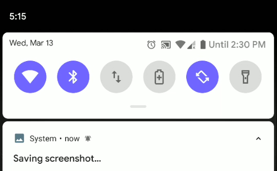
Screenshots no longer include the notch
One of the most controversial changes found in the first Android Q beta was the fact that screen curves and display notches were included in screenshots. We’re happy to report that this decision was quickly reversed with the second beta.
iOS-like app-switching gestures
It was no secret that most people weren’t fans of Google’s gesture-based navigation controls introduced in Android Pie. To fix them, it appears as though the search giant is working to copy iOS.
As you can see from the above GIF, in Android Q you can now swipe left or right on the Home button to move between apps. This behavior is very reminiscent of the gesture controls found on modern iPhones and the latest iPad Pros.
If this doesn’t remind if enough of Apple’s way of doing things, it was found that Google might be working to remove the Home button altogether. With a bit of adb work, Android Q actually replaces the current navigation bar with a long and thin one that is almost identical to the bar used on iOS.
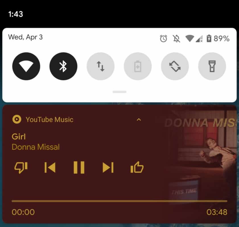
Media playback progress bar in notifications

Android has always made the notification center a key piece of using the OS. With the second Android Q beta, is improving the media playback widget to show a progress bar in addition to playback controls.
Choose your own notification swipe directions

In the first Android Q beta, Google introduced a new way to swipe away notifications. Instead of being able to swipe something away in either direction, the OS made it so that notifications would disappear when swiped to the right and would show a menu when swiped to the left.
With the second Android Q beta, Google is giving users control over which way they would like to swipe away notifications. As you can see from the above photo, you can now decide if you want to dismiss notifications to the left or the right.
To change the way notification swipes work, simply head to Settings > Apps & notifications > Notifications > Advanced > Swipe actions
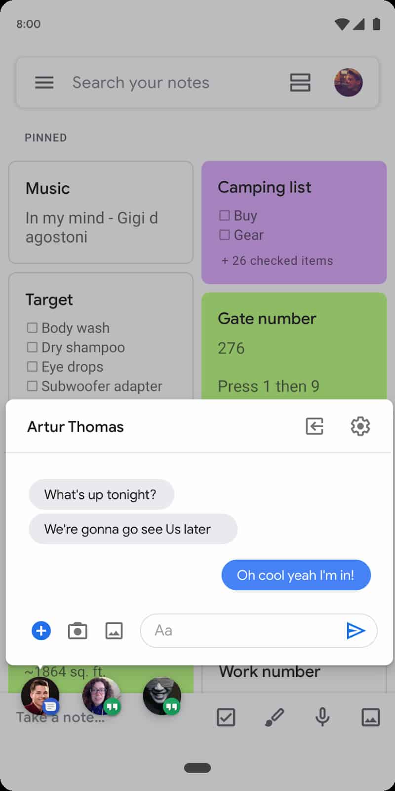
Facebook Messenger-style ‘chat head’ Bubbles
If you’ve ever used Facebook Messenger on Android, you should be familiar with the app’s “chat heads.” Basically, when you receive a new message, a circular icon will pop up over the rest of your phone. Google appears to be borrowing this feature with Android Q.
As you can see from the photo, the second Android Q beta introduces something Google is calling “Bubbles.” This new type of notification works identically to chat heads, but is a feature that any messaging app will be able to implement.
Google account integration in settings
Android Q beta 2 adds a new Google account element to the settings menu (via 9to5Google). As you can see from the first photo, your avatar photo gets added to the search bar.
What’s even more interesting is what pops up when you tap on the image. Seen in the right photo, you can quickly manage your Google account, find information about the device, edit emergency info, and more.
Android Q Beta 1
Accent colors and theming options
- default blue
- purple
- green
- black
It’s been a long time coming, but Android Q finally (finally!) supports different accent colors. In the developer settings at the very bottom, you’ll find a new “theming” section with three options: Accent color, Headline / Body font, and Icon shape.
You now have the choice between four accent colors: default blue, green, black, and purple.
Choosing the Headline / Body font option in your settings menu will allow you to choose between the device default font (the one shown in the images above) and Noto Serif / Source Sans Pro. Here’s what it looks like:
Finally, the Icon shape option will look quite familiar. From here, you can change all your app icons to the device default (circle), teardrop, squircle, or rounded rectangle.
Battery icon on the always-on display
Google has moved the battery icon from its bottom-center position to the upper-right corner of the always-on display.
Estimated battery in quick settings
Android Q’s quick settings menu will now show you how long your battery is expected to last.
Sharing menu improvements
Google is bringing some much-needed improvements to Android’s sharing menu. Not only does the share menu look a bit different than it did before, the entire menu shows up way faster than it did in previous Android versions. Take a look at the GIF attached here to see what I mean.
Notches and rounded corners in screenshots
In previous versions of Android, the system would fill in the gaps if it noticed a notch cutout or rounded screen edges. Not anymore! Take a look at that glorious screenshot of the Pixel 3 XL to see what I mean.
Swiping right on notifications
- Swiping away to the right
- Context – swiping left
- Visual context menu
You can no longer swipe notifications away willy-nilly. A quick swipe right will still clear your notifications, while a swipe to the left will bring up the context menu — something you could only bring up with a half-swipe in previous Android builds. A swipe to the left will give you options to ‘snooze’ or ‘mute’ a notification, while expanding it gives you even more options, such as ‘block’, ‘show silently’, or ‘keep alerting’.
Android Q night mode is gone… but don’t worry!
In Android Pie, Google introduced a “device theme” section in the display settings menu. From here, you could either turn on Android’s dark mode at all times, or just when you set a dark wallpaper. Now that option is gone, unless you enabled the dark theme when you installed Android Q. If you did, you should have the option to turn on a system-wide dark theme that even expands into the settings menu.
There are two workarounds to enable dark mode, however, either by toggling the Battery Saver option or via ADB commands. Nevertheless, this is a very early build of Android Q, and Google adds and removes things from developer previews all the time. So there’s a good chance dark mode is coming back in a future build, without the need for workarounds.
Bell next to notification timestamps
Have you ever wondered which one of your notifications made your phone actually ring? Google is clearing that up in Android Q. Now, if your phone rings from a notification, you’ll see a little notification bell right next to the notification’s timestamp. It’s a little change, but a welcome one for sure.
Sharing Wi-Fi with QR codes
If, by chance, you’d like to share your Wi-Fi network with a friend, you can now do so via QR code. Just select the network you want to share, click the Share icon, and verify your phone’s passcode. A unique QR code will show up that your friend can use to easily scan and join the Wi-Fi network.
Emergency button in the power menu
In Android Q, long-pressing the power button will display a new Emergency icon. Tap this icon and you’ll have quick access to an emergency dialer.
Privacy section in Settings
Privacy is front and center in Android Q, and that starts with a new section in the settings menu. This new privacy section will give you access to your app permissions, lock screen content settings, preferred autofill service, location history, and usage and diagnostics settings.
Revised Material Theme throughout the whole OS
Google has streamlined many areas that looked “off” in some of the menus around Android. In Android Q, things like the wallpapers app, app info pages, and more have been tweaked with Google’s new Material theme.
A secret desktop mode
Google has followed in Huawei and Samsung’s footsteps by offering a desktop mode on Android. This will deliver a computer-style interface when you connect your phone to an external display. You might have to dig to find this feature though.
That’s it for now. We’ll update this list as we find more changes in Android Q. Have you found any that aren’t listed here? Let us know in the comments, and check out even more Android Q coverage below:
- All the new APIs introduced in Android Q
- The full Android Q update timeline
- Every phone compatible with Android Q Beta 3
- How to install Android Q Beta 3 on your non-Pixel phone
- Big changes are coming for Google’s Android distribution chart
from Android Authority http://bit.ly/2uR1gey
 Reviewed by US Tech News
on
May 08, 2019
Rating:


No comments: